Truncate text in TailwindCSS
There's nothing worse than when a well-designed website falls apart because a position contains longer text than intended. It could be a long product description, a comment, anything.
To improve user experience and enhance the visual presentation of content, you need to cut off the unnecessary text. Fortunately, you don't need to write any server-side or client-side code to achieve this. You can do it simply using CSS.
TailwindCSS offers two simple solutions.
The truncate class
The truncate class allows you to limit the text so that the result is always a single line. If the text is long, the three dots ... will appear at the end of the line. In this case, the text will not be broken into multiple lines even if there is enough space.
<div class="flex">
    <div class="m-4 p-4 w-1/4 bg-slate-100">
        <div>Original: Lorem ipsum dolor sit amet consectetur adipisicing elit. Labore, veritatis!</div>
    </div>
    <div class="m-4 p-4 w-1/4 bg-slate-100">
        <div class="truncate">
            Truncated: Lorem ipsum dolor sit amet consectetur adipisicing elit. Labore, veritatis!
        </div>
    </div>
</div>
And the result is:
The line-clamp-x classes
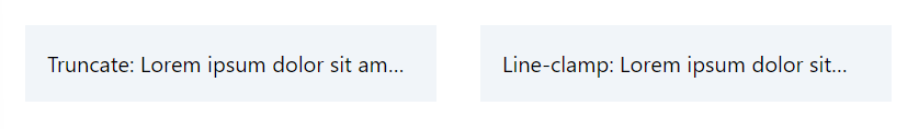
The line-clamp-{x} classes give you more freedom. Here, you can specify the maximum number of lines of text the browser displays on the screen. Using line-clamp-1 gives the same result as with truncate . It's worth noting that although the appearance stays consistent, the applied css is different.
<div class="flex">
    <div class="m-4 p-4 flex w-1/4 bg-slate-100">
        <div class="truncate">
            Truncate: Lorem ipsum dolor sit amet consectetur adipisicing elit. Labore, veritatis!
        </div>
    </div>
    <div class="m-4 p-4 flex w-1/4 bg-slate-100">
        <div class="line-clamp-1">
            Line-clamp: Lorem ipsum dolor sit amet consectetur adipisicing elit. Labore, veritatis!
        </div>
    </div>
</div>
The result is:
The pure CSS for truncate and line-clamp is:
.truncate {
    overflow: hidden;
    text-overflow: ellipsis;
    white-space: nowrap;
}

.line-clamp-1 {
    -webkit-box-orient: vertical;
    display: -webkit-box;
    overflow: hidden;
    -webkit-line-clamp: 1;
}
However, if you want to keep multiple lines of text under control, line-clamp is the only option. It allows you to specify, for example, that you want to display a maximum of 2 lines of product description. All you need to do is use the line-clamp-2 class.
<div class="flex">
    <div class="m-4 p-4 flex w-1/4 bg-slate-100">
        <div class="truncate">
            Truncate: Lorem ipsum dolor sit amet consectetur adipisicing elit. Labore, veritatis!
        </div>
    </div>
    <div class="m-4 p-4 flex w-1/4 bg-slate-100">
        <div class="line-clamp-2">
            Line-clamp: Lorem ipsum dolor sit amet consectetur adipisicing elit. Labore, veritatis!
        </div>
    </div>
</div>
And the difference between truncate and line-clamp-2 is the following:

Note 1
It's important to know that if your container element is higher than the number of lines you want to limit the text to, you will get a strange result. For example, if the height of the div element containing the text is h-24 and we use the line-clamp-2 class, the result is less than optimal.
<div class="m-4 p-4 flex w-1/4 bg-slate-100">
    <div class="line-clamp-2 h-24">
        Line-clamp: Lorem ipsum dolor sit amet consectetur adipisicing elit. Labore, veritatis!
    </div>
</div>
The text also appears ugly. All of the text is displayed in 3 lines instead of 2 and the three dots appear in the middle:

You can solve this problem by creating a wrapper element that has no height definition:
<div class="m-4 p-4 flex w-1/4 bg-slate-100">
    <div class="h-24">
        <div class="line-clamp-2">
            Line-clamp: Lorem ipsum dolor sit amet consectetur adipisicing elit. Labore, veritatis!
        </div>
    </div>
</div>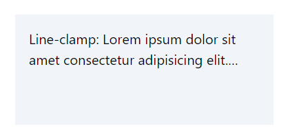
Note 2
You should not apply display property modifying classes such as flex , grid , block to an element containing text. These will result in an unexpected design.
<div class="flex">
    <div class="m-4 p-4 flex w-1/4 bg-slate-100">
        <div class="truncate flex">
            Truncate: Lorem ipsum dolor sit amet consectetur adipisicing elit. Labore, veritatis!
        </div>
    </div>
    <div class="m-4 p-4 flex w-1/4 bg-slate-100">
        <div class="line-clamp-2 flex">
            Line-clamp: Lorem ipsum dolor sit amet consectetur adipisicing elit. Labore, veritatis!
        </div>
    </div>
</div>
As you can see below the ellipsis is missing and the output is not what you probably want.

The solution to wrap text into a separate container element only works in case of line-clamp but not with truncate :
<div class="flex">
    <div class="m-4 p-4 flex w-1/4 bg-slate-100">
        <div class="flex">
            <div class="truncate">
                Truncate: Lorem ipsum dolor sit amet consectetur adipisicing elit. Labore, veritatis!
            </div>
        </div>
    </div>
    <div class="m-4 p-4 flex w-1/4 bg-slate-100">
        <div class="flex">
            <div class="line-clamp-2">
                Lorem ipsum dolor sit amet consectetur adipisicing elit. Labore, veritatis!
            </div>
        </div>
    </div>
</div>
As you can see on the output:

Resources