Set focus border in TailwindCSS
Using borders is a simple CSS task. Except the cases when you want to use it on an input element, where it is a bit more complicated, and you need to be more careful.
But what is the problem?
Take a simple input element and add a border.
<div class="flex p-4 justify-center">
    <input class="p-2 border-2 border-lime-600" type="text" value="Default input with border" />
</div>
So far, so good.
The problem starts when we try to write in the field, and it comes into focus . This event causes the specified border to change. Not only will the color be different, but the border radius will also change.

No problem just set the right border color for focus :
<div class="flex p-4 justify-center">
    <input
        class="p-2 border-2 border-lime-600 focus:border-red-500"
        type="text"
        value="Focused input with border"
    />
</div>
Oops, something is wrong. We set the border color to red, and it still appears black:
What is the explanation?
Browsers automatically highlight the currently active input field for a better user experience. This effect is achieved by using the so-called outline property, which is automatically displayed when an input element gets the focus. The color of our border changes, but it's not visible because the outline shape hides it. If we adjust the border thickness, we can see better what is the outline, and what is the border:
<div class="flex p-4 justify-center">
    <input
        class="p-2 border-4 border-lime-600 focus:border-red-500"
        type="text"
        value="Focused input with border"
    />
</div>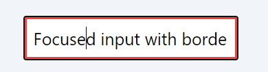
Fortunately, the solution is quite simple. If you want to set the border color yourself, you can turn off displaying the outline using the outline-none utility class:
<div class="flex p-4 justify-center">
    <input
        class="p-2 border-2 border-lime-600 focus:border-red-500 outline-none"
        type="text"
        value="Focused input with border"
    />
</div>